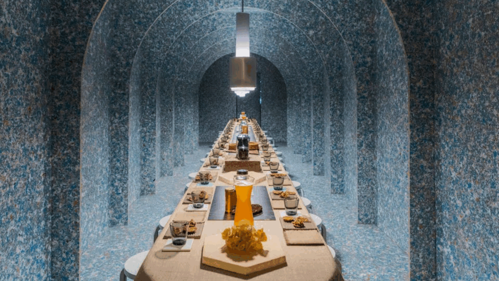
To mark the 35th anniversary of the International Contemporary Furniture Fair (ICFF), the ICFF team has unveiled a new vision to support design companies and their success throughout the year. This refined approach includes solidifying ICFF’s role as a business accelerator; transforming the brand into a 365-day-a-year platform; and clarifying its objective as being at the center of design culture, community, and commerce.
To translate this strategy into visual form, the ICFF team asked award-winning creative agency forceMAJEURE to develop a new brand identity for ICFF. It will be implemented across our platforms in the coming weeks.
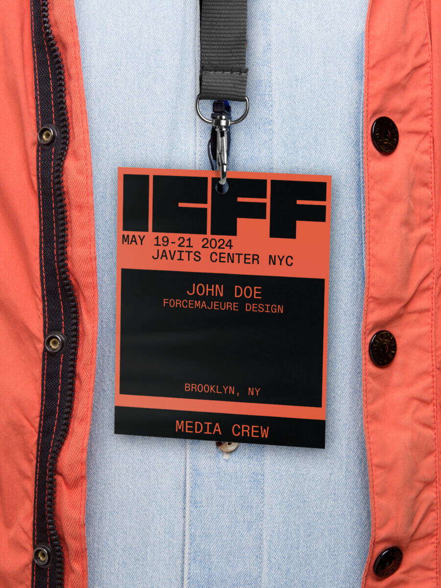
The rebrand reflects the spirit of New York. A grid system underpins the visual language, allowing new elements—including color and images—to be added, moved around, and evolve as desired. The distinctive logo, which remains in the previous palette of black and white, now comprises a solid, heavy wordmark juxtaposed with a lighter, supportive typeface.
Following, Laurent Hainaut, the founder and CEO of forceMAJEURE, discusses the process of designing the new language and strategy that shaped its form.
What were some of the challenges forceMAJEURE faced when designing the new logo?
I think it’s important to say that this was a full visual identity project, not just a logo redesign.
When we started, the question was, “We have a new position and a new story. We are shifting the way we think about the Fair. How can you help us express those changes in our visual identity?”
From there, we considered the experience we wanted people to have when they interacted with the ICFF brand. On one hand, ICFF needed a visual identity that felt more distinctive but, at the same time, could provide the flexibility to amplify a multitude of individual expressions.
From brand strategy and logotype to typeface and navigation, we needed to make this repositioning of ICFF work across all mediums. That meant from press releases to the website to the show itself.
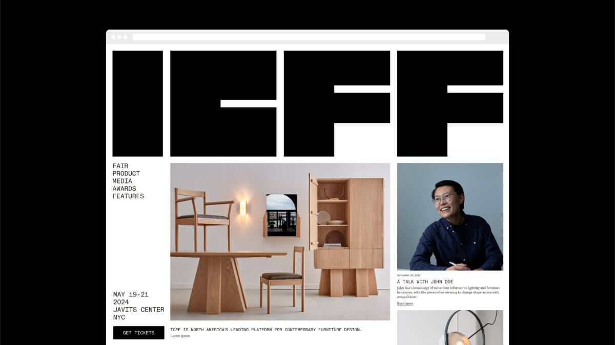
A proposed home page for the ICFF website.
What were the first steps you took?
The first step is always to align on strategy with the brand lead, marketers, sales teams, and all stakeholders. We can then translate the functional strategy into a visual and verbal strategy.
We needed to understand the audience. Who is going to interact with the brand? Existing exhibitors and attendees are expecting different outcomes. How do we talk to each of them?
How would the new branding live alongside the branding of other ICFF features, such as WantedDesign? And how could we ensure that those who know and love ICFF don’t get lost in this new identity?
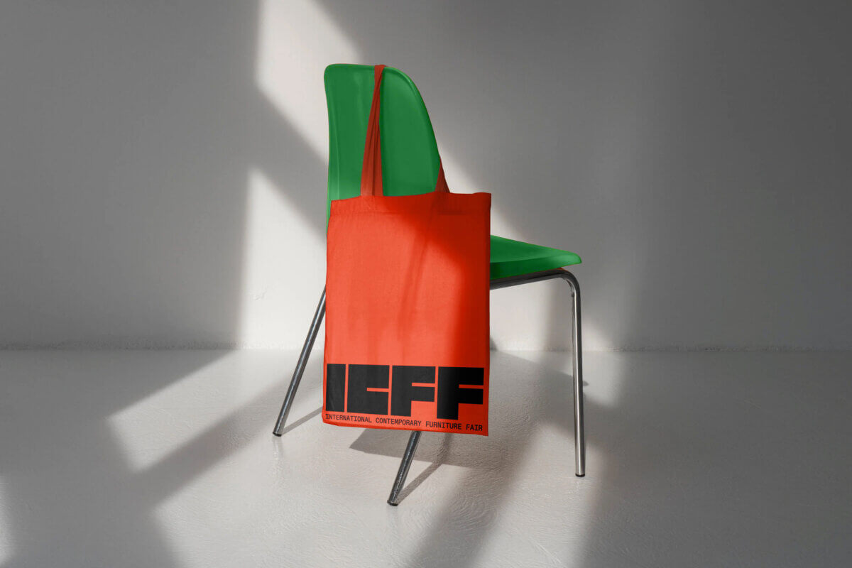
Finally, which parts of the existing identity should we keep? It’s usually just the essentials. So in this case, it was a black square and four letters: ICFF.
Why did you introduce color into the Fair’s visual language?
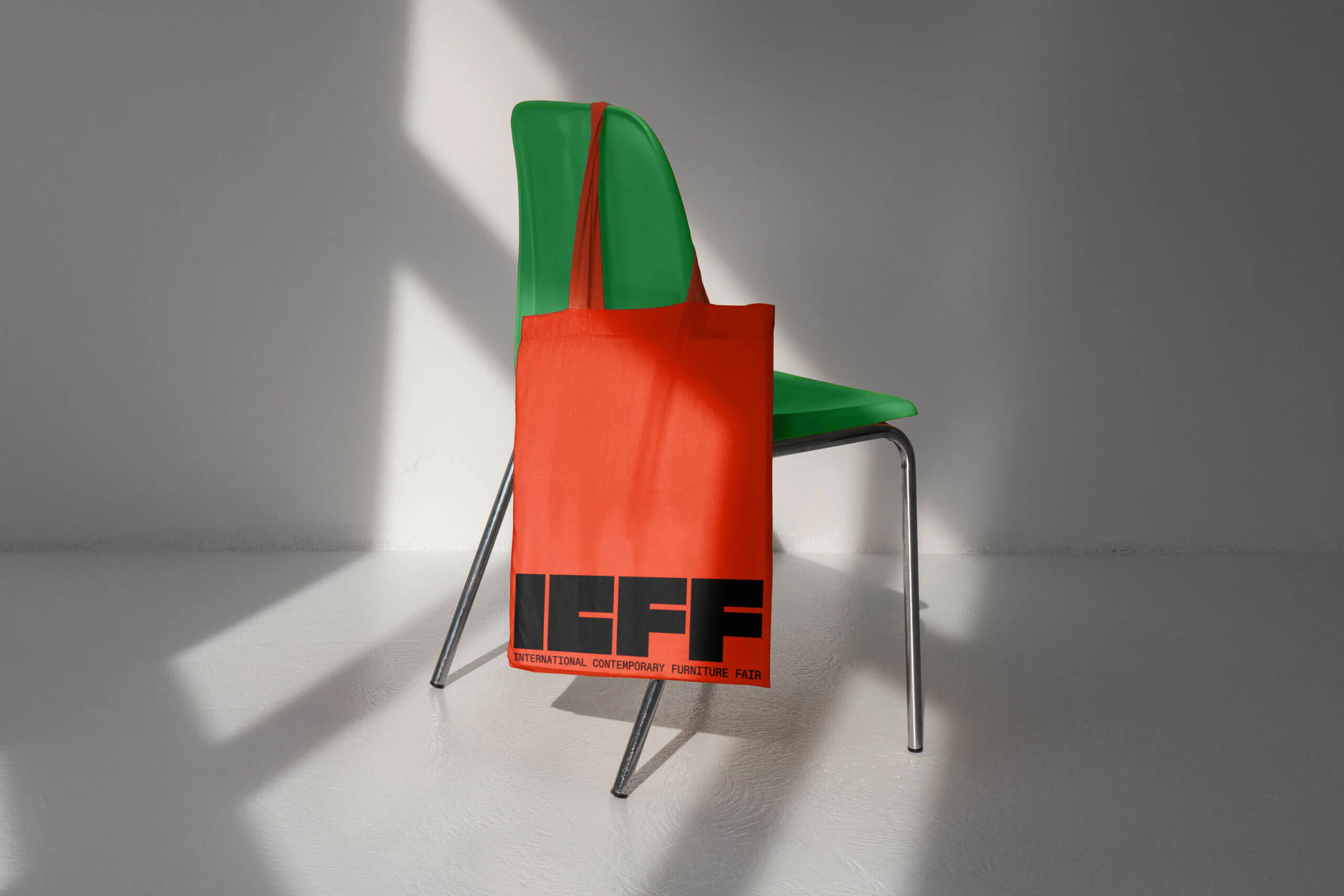
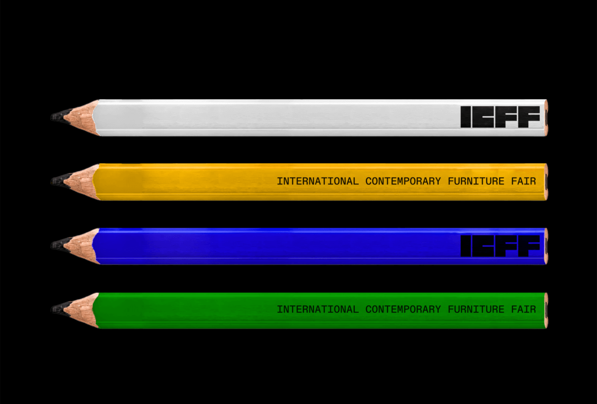
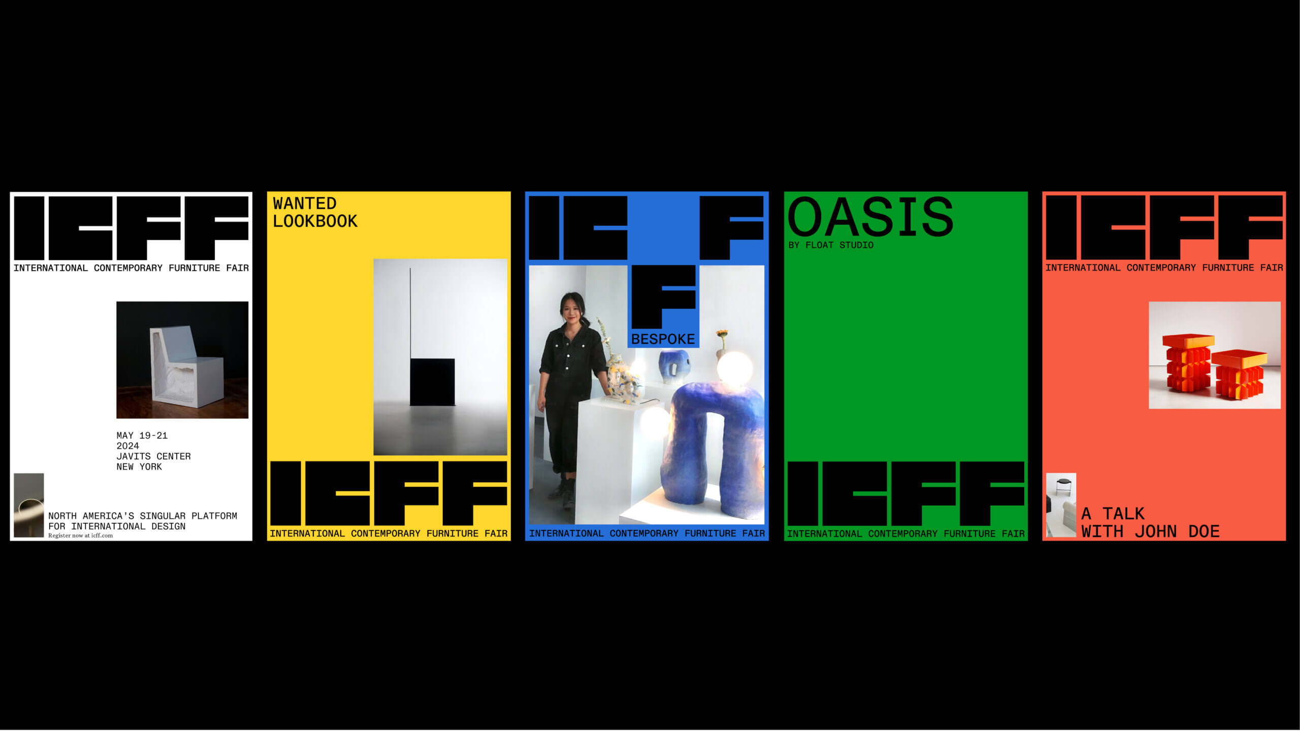
ICFF’s former visual identity was stark and dark. Given the success of the vibrant yellow in WantedDesign’s visual identity [ForceMAJEURE created that identity; sections of Wanted, including Look Book, Launch Pad, and Schools Showcase, are now part of ICFF], we decide to attribute colors to the Fair’s different features. That way each has a strong personality.
Wanted remains yellow, Oasis [which focuses on sustainability] will be green, and Bespoke [centering around high-end craftsmanship] will be blue. And we will extend the palette as needed.

A new color palette distinguishes the different sections of ICFF.
What other considerations shaped the visual identity?
Our new vision for ICFF is highly connected to its home in New York. The city was key in unlocking the new positioning and identity for ICFF, as it truly embodies everything we want to communicate. It is bold and universally recognized. It is international. It is a portal to the U.S. and North American markets.
Taking a birds-eye view of the city, we saw the grid of its urban planning, the large blocks that comprise it. We observed this modularity. People circulate up, down, and across these blocks. It is an amazing visual parallel to spatial design!
Taking cues from that, we created a modular grid system for the visual identity. We can adapt it as needed, adding and moving elements such as text, images, and color around to tell different stories.
What is your favorite part of the new identity?
The first impression! I love the boldness of the new logo. The voices and work within the ICFF community are so distinctive and impressionable. It feels right to have a logo that translates their energy into a shared icon.
Additionally, in 2024, it’s critical to be seen and to be remembered. With its new visual language, ICFF now communicates with impact. It conveys that is not only a wonderful legacy brand, but also the leader in the field.
Being a leader is being bold and being proud. The new branding is doing that.